TL;DR

Get home appliances delivered free with Prime
- Fast, free delivery on millions of items
- Prime Video, Amazon Music and more included
- Member-only deals all year
A House Beautiful report features six paint colors that interior designers say can lend rooms a vintage or lived-in feel: Wedgwood blue, butter yellow, oxblood, warm parchment, pale peach and midnight blue. The recommendations are design opinions, not evidence that paint alone makes a home historically authentic.
House Beautiful has published a list of six paint colors that interior designers say can give rooms a more vintage, lived-in character, offering color ideas for homeowners who want to add a sense of age without changing furniture or accessories. The shades are Wedgwood blue, butter yellow, oxblood, warm parchment, pale peach and midnight blue.
The recommendations come from interior designers quoted by House Beautiful, who describe how color can affect a room’s mood and perceived history. The report presents the shades as design choices, not as a guarantee that a newly built or recently renovated space will look genuinely old. Its examples range from soft, muted colors to deep, saturated tones.
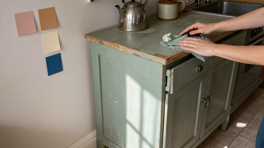
Wedgwood blue is described as a dusty blue-gray, while butter yellow offers a creamier, sunnier alternative. Jessica Risko Smith of Santa Barbara firm JRS ID says Wedgwood blue shifts with changing light and that her team used it in a kitchen to give new cabinetry a sense of age. New York designer Andrew Suvalsky calls butter yellow a link to the 1960s and suggests it for places such as ceilings and kitchens.
The other recommendations broaden the palette. Oxblood, according to Graham & Brown design expert Iona Graham, can add warmth and a cocooning quality, particularly in smaller rooms or on accent walls. Smith favors warm parchment over stark white for a softened, sun-faded effect. Suvalsky describes pale peach as both fresh and cozy, and midnight blue as a strong, architectural shade that can pair with wood, brass and gilded finishes.
Color as a Shortcut to Character
For homeowners working with a new build or builder-grade interior, the list addresses a common design challenge: rooms can feel plain before furnishings and personal details are in place. Paint is one way to change that first impression, and the designers’ suggestions give readers a range of options—from a warm neutral to dramatic blue or red—rather than treating vintage style as one fixed palette.
The advice also underscores that the effect depends on shade, light and placement. A soft blue may read differently through the day, while a dark color may feel more immersive in a small room than across every wall. Those points make the list useful as inspiration, but readers should treat the descriptions as professional judgment rather than a tested formula for creating a period-authentic interior.
Products Worth Considering

Hisense 85 U7 Mini-LED ULED 4K UHD Smart Google TV (85U7SG, 2026)

Philips Hue Festavia Globe Outdoor String Lights, 8 Bulbs, 22 ft

Bose SoundLink Flex Bluetooth Speaker (2nd Gen), Black
As an affiliate, we earn on qualifying purchases.
Six Shades, Different Eras
The report links its colors to a mix of historical references and familiar interior styles. Suvalsky associates butter yellow with the 1960s, while the article says pale peach has appeared in both softer midcentury versions and bolder iterations of the 1980s. Wedgwood blue is compared with the feel of old European farmhouses and coastal cottages; the name references the English fine-china brand.
Other shades are framed less as references to a single decade than as colors that can suggest age or permanence. Graham describes oxblood as heritage-inspired, while Smith says warm parchment can soften a newer room. The midnight blue example is a wet bar, where the color is shown alongside gilded details, warm wood and brass. The report does not provide paint-brand codes, product specifications or a standardized method for assessing the vintage effect.
““It reads differently in every light: almost slate in the morning, almost soft denim by afternoon.””
— Jessica Risko Smith, interior designer at JRS ID, as quoted by House Beautiful
The Limits of the Vintage Effect
The article offers designers’ opinions and project examples, not comparative research showing that these six shades reliably make homes look older. It does not identify exact paint products, finishes, color values or room-light conditions, so readers cannot assume that a named shade will look the same in every space. The supplied material also gives no publication date.
It remains a matter of interpretation whether a color reads as vintage, contemporary or simply warm and dramatic. Furniture, architecture, finishes and natural light can all affect the result; the report does not quantify how much any one factor contributes.
Testing the Palette at Home
The report does not announce a follow-up, product launch or scheduled next development. For readers considering one of the colors, the designers’ descriptions point toward testing a sample in the intended room and observing it under different lighting before committing to a full application. That step is especially relevant for blue-gray shades and saturated colors, which may shift in appearance or feel more intense across a large surface.
Any choice should be judged against the room’s existing finishes and furnishings, rather than the color name alone. The article leaves that practical decision to homeowners and their design teams; it does not specify a single preferred brand, finish or application method.
Key Questions
Which six paint colors does the report recommend?
House Beautiful lists Wedgwood blue, butter yellow, oxblood, warm parchment, pale peach and midnight blue, based on recommendations from interior designers.
Are the recommendations a guarantee that a room will look vintage?
No. They are designers’ opinions about how particular colors can suggest age or character. The report does not present research showing that paint alone makes a room look historically authentic.
Which shade is suggested for a softer alternative to stark white?
JRS ID designer Jessica Risko Smith recommends warm parchment, describing it as a white-family shade with yellow or blush undertones that can soften a room.
What colors does the report associate with smaller rooms?
Graham & Brown expert Iona Graham says oxblood can work particularly well in smaller rooms or on accent walls, where its saturated tone may create a cocooning atmosphere.
Source: housebeautiful.com